Surphic | Surf Good Graphics
Algarve is the southern most region of Portugal with a rich architectural heritage and urban designs that immediately caught the attention. On the other hand you can quickly notice that surf is there a well known sport that many people practice on a daily bases.
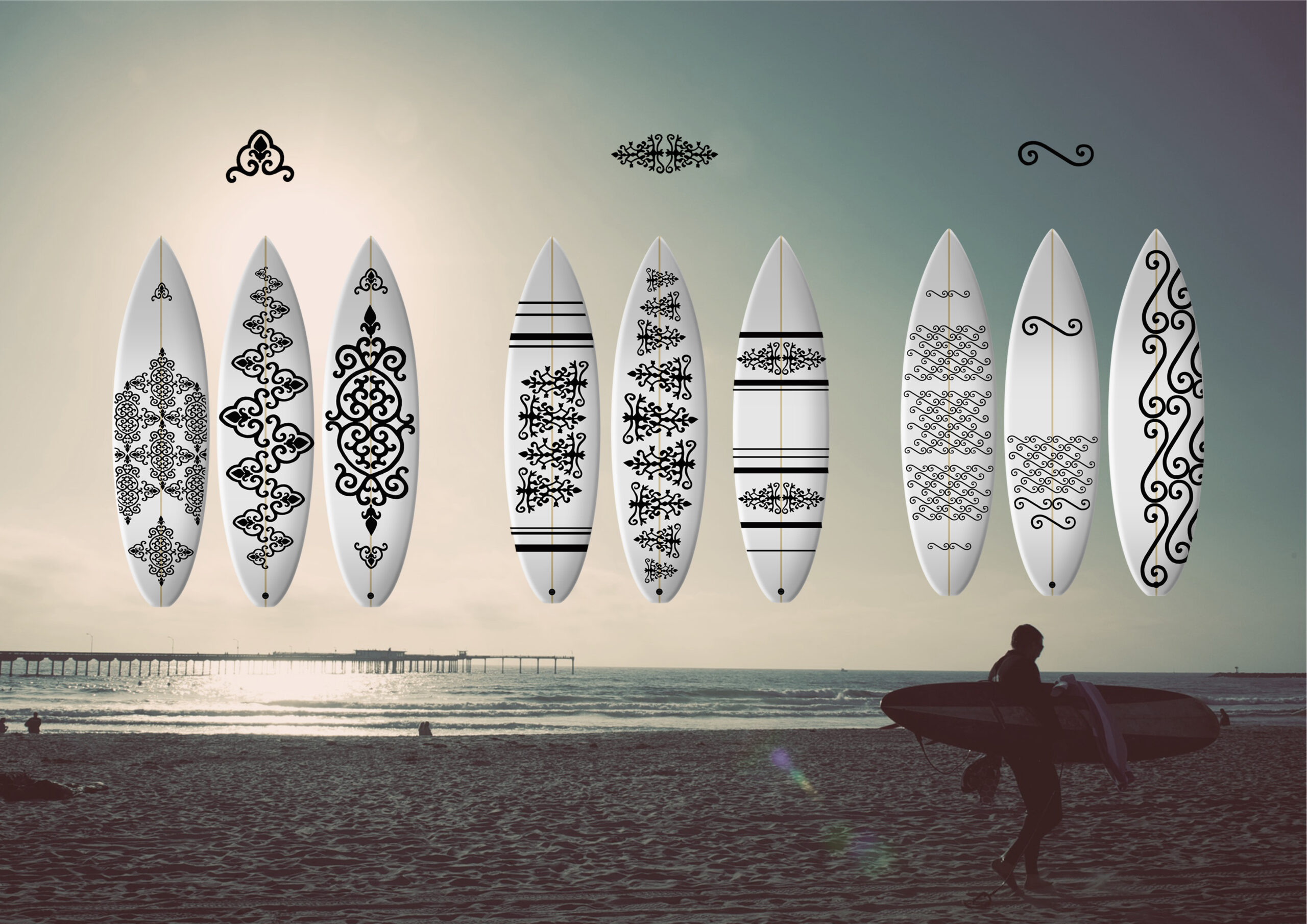
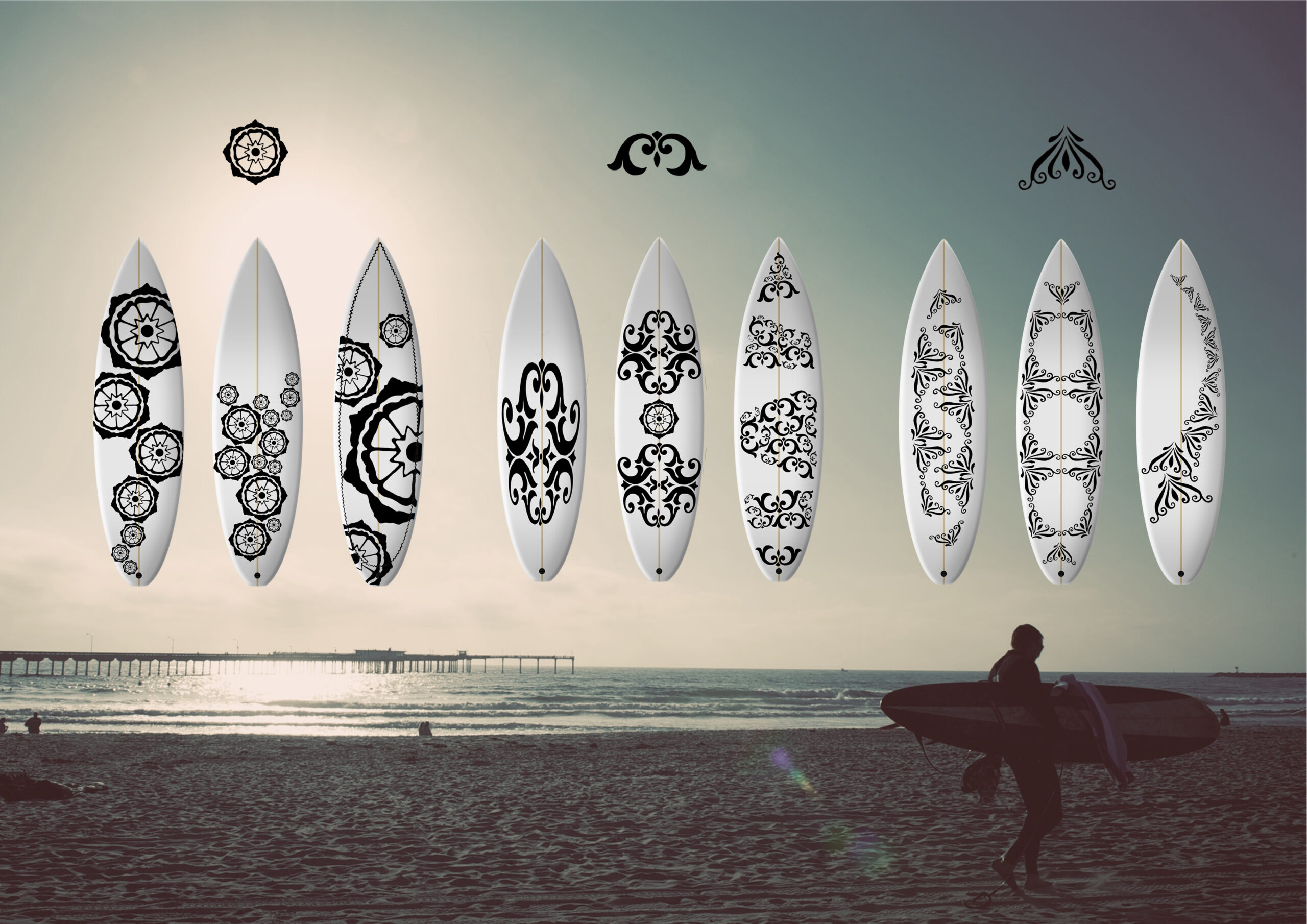
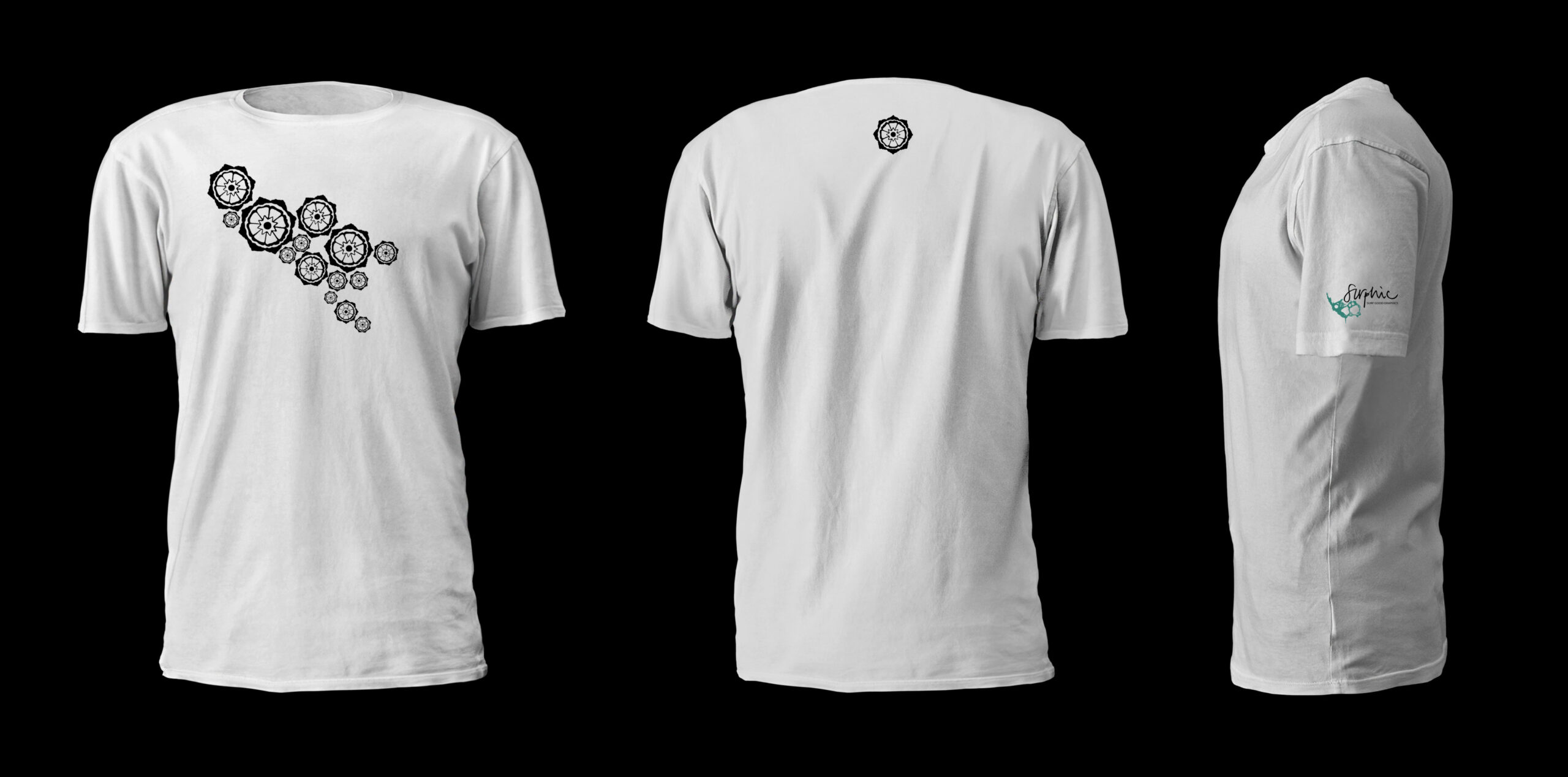
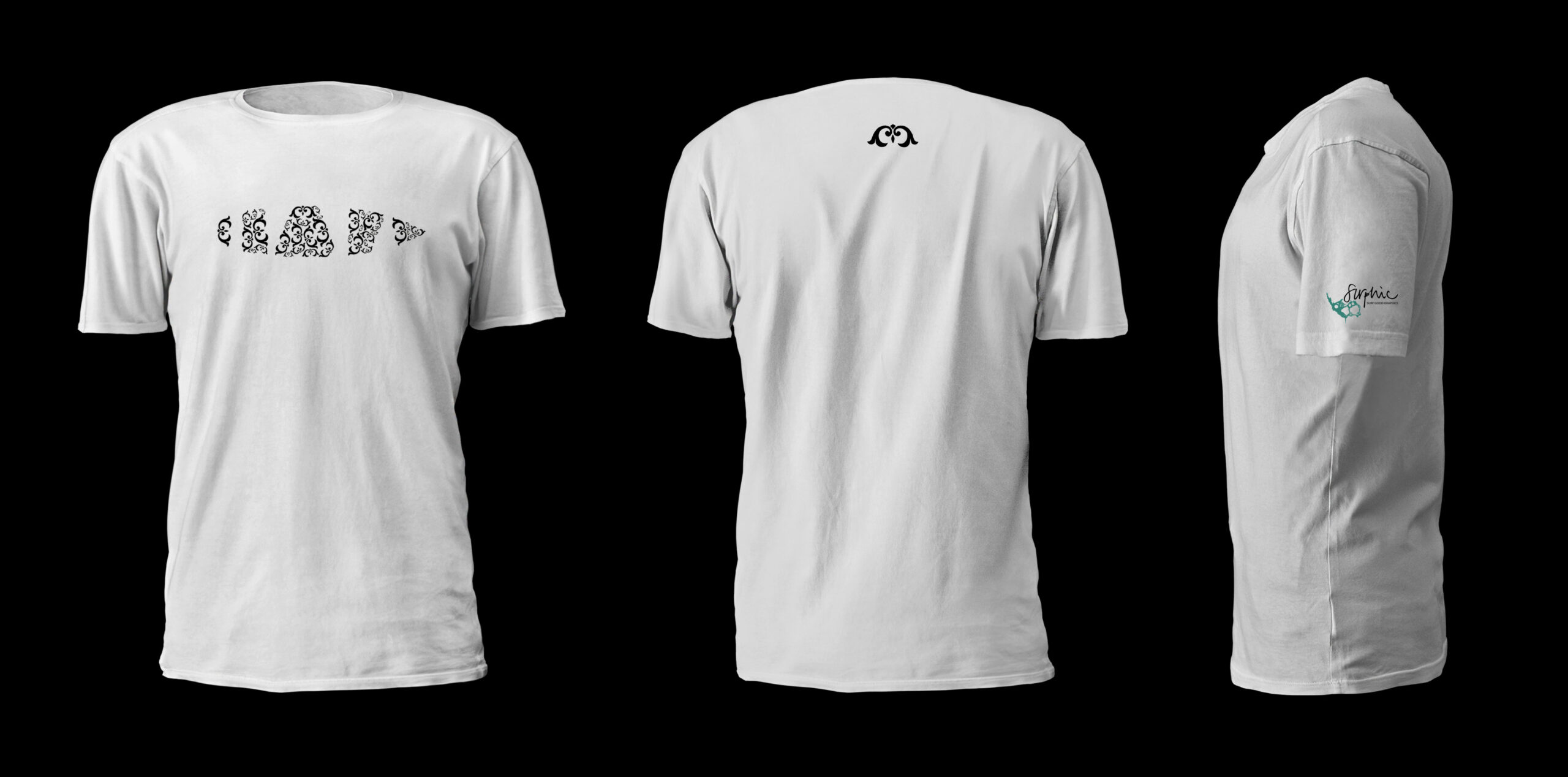
I was inspired by all the details exposed in the cobbled streets, the front facades of the houses called platibandas, typical Portuguese ceramic tiles or even the characteristic birds you can spot there, a stork and flamingo – to create new patterns and designs for the surfboards, that would be recognizable for the Algarve and Portugal. Merging the urban patterns with surfing can contribute to add value and rediscover the richness of Portuguese culture.
From collected recourses I took out interesting details and created different representative elements in six collections based on them.
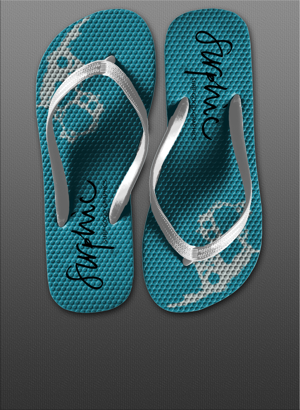
Surphic = surf + graphic
The descriptive name is handwritten representing the free lifestyle of surfers. It comes with slogan “Surf good graphics” written in higher case letters and humanist sans-serif typeface Myriad Pro. Slogan adds the positivity and connecting the lifestyle of surfers and fun.
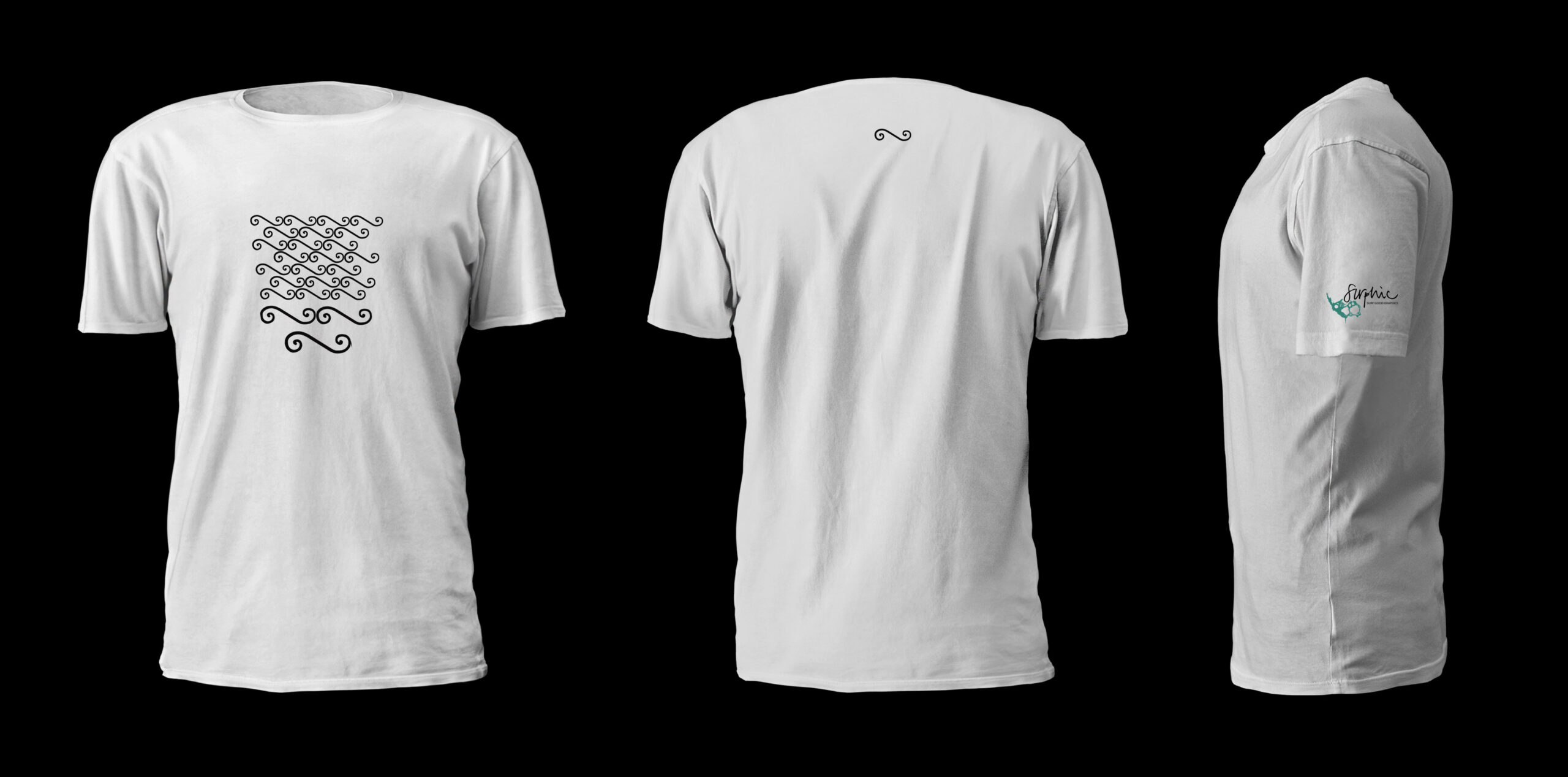
The idea of dynamic logo came from a description of the noun Surf, saying the mass or line of foam formed by waves breaking on a seashore or reef. The dynamics is achieved in the use of form of a foam, every time in different shapes, positions and sizes.
Date
- November 2014
Location
- Faro, Portugal